Why I’m so obsessed with sleeves?
Very simple – my eyes are tired. I see all the sleeve design
mistakes on myself, and on other people. And people complain all the time.
Sleeves don’t fit; sleeves don’t feel comfortable. And for me, if sleeves are
not cut well, the whole look is spoiled.
It is not like all the clothes do have badly designed sleeves,
far from it. But a lot. And it doesn’t always depend on the price, or the
label. And it’s not only ready-to-wear (RTW from now on), it’s the same with the
patterns for home sewing.
Let’s take a look at some pictures. First – from decent to
good to perfect. RTW, prices range from $44 to about $1,000.
See, how these sleeves hang? These sleeves have correct width;
folds on these sleeves are vertical, parallel to the underarm seam. On some sleeves there are some diagonal folds,
but not too bad, and sometimes it’s difficult to say if the folds are due to the
bad cut or to the body position of the model. Pay particular attention to the underarm area, see how beautifully most of these sleeves hang there?
Now, let's take a look at the bad and ugly:
See all these diagonal folds? See how wide these sleeves are in the bicep area?
And here are good sleeves for home sewing:
See? Different styles, different fabrics, different amount of ease, from different pattern companies. One thing in common - good cut of the sleeve. Wool jacket, denim jacket, jersey, shirt, blouse, doesn't matter. When it's good, it IS good.
And now bad and ugly:
All the same problems - diagonal folds, too wide in the bicep area, bad fit, and these sleeves hang badly. Would you like to sew from these patterns? I won't.
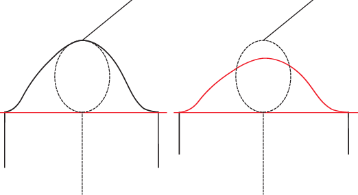
How does it happen? All the problems with badly cut sleeves above are coming from the same source - sleeve cap is too low. Here are schematics:
On the left you see a sleeve schematics with the sleeve cap that has an appropriate height. On the left - the sleeve cap is too low. To be able to set this sleeve in we need to make the sleeve wider, so that the sleeve cap will have the same perimeter length. Note, that we have exactly the same armhole for both sleeves. Then, when you close the armhole and insert the sleeve into it, it'll be like this:
And you'll have to pull the sleeve with short sleeve cap up. The result - ugly folds. Another thing that happens - the angle at which the sleeve is attached to the body of the garment changes. It changes from this:
Two things do happen then:
1. Since no one goes around with arms outstretched, folds form in the underarm area. True, such sleeve may have wider range of movement, but well designed sleeve with taller sleeve cap will have good range of movement. Besides, range of movement depends not only on the width of the sleeve, but also on the depth of the armhole. And it doesn't help if proportion between the two are wrong.
2. If the designer didn't take care to make special sleeve length adjustments (and designers who are bad enough to design sleeves with caps too low are usually not good enough to do such adjustments) the underarm seam will be too long.
Here is a fine example of such sleeve:
See the folds in the underarm? See how much extra fabric is there? Overarm part of the sleeve has correct length, but underarm seam is way too long. In my view this sleeve is just plain ugly.
And here is a blouse with wide sleeves designed properly:
No ugly folds, no excess fabric in the bicep and underarm, comfortable width, good range of movement. Just plain perfect.
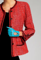
I think Chanel would fire someone who designed this sleeve on spot:
And here is a good one:
The problem with all this is that in life bad things have a tendency to become normal. Just one generation of designers who grew up on RTW and we have all these problems with design. One more generation and nobody will even know how clothes are supposed to fit. To keep things going in good way requires constant work against entropy, otherwise it takes over.
This is why I write this blog.


No comments:
Post a Comment